As discussed in the previous blog, accessibility is one of the most important things to consider when designing a website. Not only is it inclusive, ethical and expansive to your outreach and business, but it’s also enforced by the law.
At IH Concepts, we stick by the 51:49 rule, which means 51% of the design should be functional, while the other 49% is dedicated to aesthetics. Your website will have the most success if it is intuitively easy to navigate, therefore we have compiled a collection of four tips and tricks to maximize your website’s accessibility.
1. Contrast Colors on Your Website
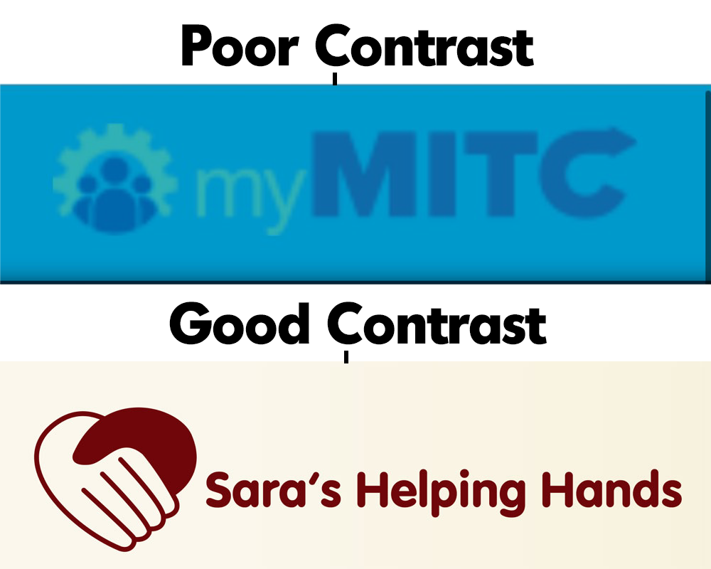
Fundamental to your design is sufficient color contrast between the text and background colors. This means that the background should be light, and the text should be dark or vice versa. For this, you can play around with tints and hues of colors, as long as you ensure that the text is legible.
For example, if you have a dark blue background and teal text, most people – especially those with visual impairments – will have a hard time reading your text. However, a navy blue background with white text allows effortless legibility for people of all abilities.
2. Provide Alternative Text for Your Images
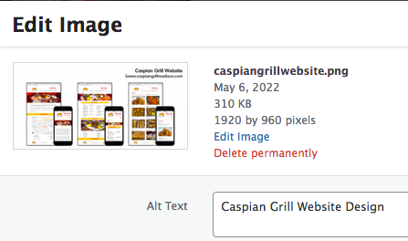
Alternative text, known colloquially as alt text, is a description of what an image, photograph, or button is. Alt text is essential for screen reading softwares, which is a tool used by people who are blind or with other visual impairments to interact with digital platforms.
It will also enhance your Search Engine Optimization (SEO), making your website rise toward the top in search engines and subsequently more findable and popular. A poor example of alt text is “Image of a sign,” which is nondescriptive, obvious, and doesn’t include what the sign actually consists of. Instead, it would be better to say, “A pedestrian crossing sign.”
3. Have Closed Captions in Your Videos

Closed captions are captions offered on a video that include speech and background noises, music or a change in speaker. This creates audio that is accessible to those with a hearing disability – which around 5% of the world has.
Oftentimes, Facebook and YouTube will have the option for auto-generated closed captions, but if you have your own method for uploading videos to your website you may need to take the extra steps to include them. Any web video content you have should include the option for accurate closed captioning to allow everyone to experience it.
4. Make Sure Your Text is Legible

Choose a text font that is straightforward, and a large enough size so your content is legible. Some fonts, such as cursive fonts are not as easy to read as basic, timeless fonts like Times New Roman. Check out this article for a comprehensive list of fonts that are the most readable to users, according to the Bureau of Internet Accessibility. You may also want to consider differentiating headers, titles, links and the body text. For example, making titles larger and bolder, underlining links, or choosing a different font for the body text.
Conclusion
The American Disability Act, which is what requires accessible digital platforms by law, doesn’t have an official guidebook on what your website should look like. However, in general, the 2.1 version of the Website Content Accessibility Guidelines is widely accepted by the ADA and Department of Justice, who enforces the act. For a more comprehensive list on accessibility, look into the WCAG 2.1.
There are also websites that will review your websites based on the WCAG for a cost, such as audioeye.
By giving your attention to things such as color contrast, alt text, closed captions and your text’s legibility, your website can become increasingly accessible to people of all abilities.