
Graphic design uses colors and strategic design to communicate a message, establish a brand, evoke a feeling, and much more. Using colors harmoniously is a crucial step to making a piece effective.
A key part of that process is understanding colorspace, the specific organization and combination of colors. It is beneficial to understand colorspaces so you can understand a complex step in creating your designs to their greatest potential.
The Three Main Colorspaces
There are three general groupings of colorspace which include RGB, CMYK, and pantones, also known as PMS colors, and spot colors. RGB, or Red Green Blue, is a larger colorspace and is the combination of colors you see digitally on screens.
The colors in RGB are typically a brighter color because of the backlit digital screen, but that can change depending on the monitor quality on a computer or tablet. The RGB colorspace is typically seen on websites, digital advertisements, popup ads on computers or tablets, presentations and slideshows, TV menu boards, and more.
CMYK, on the other hand, is a smaller colorspace that is used for print and graphics. CMYK, or Cyan Magenta Yellow Black, is what you see on physical flyers, prints, signage and more.
Lastly, Pantones and spot colors are colors used when an exact color needs to be replicated. These colors are used with offset printing presses, which are printers that use a particular mix of ink for each color instead of toners. Pantones, for example, are used with large companies when they need to replicate their signature brand color in advertising or marketing.
Differences Between the Colorspaces
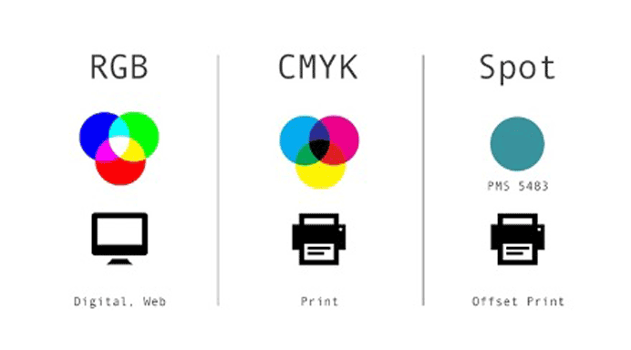
Image Source:
Glasscanopy
It is important to understand the differences between the different colorspaces so that you avoid any mistakes that come with using each of them improperly. First, it is crucial that you keep checking how your RGB colors on a computer are translating to CMYK colors for when they are printed out. Because RGB is pixels on a computer and CMYK is a physical mix of colors, the colors may change when they are transferred from digital to print.
Similarly, it is important to keep in mind that RGB may show up differently on print because of the quality of a monitor or screen and the lighting in which you’re designing on the monitor. These factors can similarly affect how your RGB digital design shows up on CMYK physical mediums.
It is also important to note that Pantone colors can be used along with CMYK. A print job does not need to be strictly CMYK or Pantone, they can be used together. Pantone, however, is mostly used for limited print jobs with one or two colors and when a specific color must be replicated perfectly.
If you want to mix CMYK and Pantone on one project, it is crucial that you make sure the printer supports a five or six color job. Commercial printers typically need a license to print Pantone colors. If your printer only supports CMYK, make sure you convert the desired Pantone color to CMYK before printing.
RGB Versus CMYK

Above is an example of how RGB and CMYK can appear very differently. As you can see, the CMYK version appears a little less vibrant and less three dimensional.
This example also points out that neon colors especially are extremely difficult to replicate from RGB to CMYK. In order to avoid your final graphic design product from changing its look as dramatically as this example, make sure you are following the tips below.
Tips for Using them Correctly
To ensure that your graphic design turns out as you expect, keep these tips in mind. First, as mentioned before, make sure to check how your RGB will look if you print it out. By test printing your design, you can make changes to your project if the shift from RGB to CMYK brought any color changes or surprises.

Image Source:
Ashworth Creative
On a similar note, if you are planning on printing your graphic design, you can easily change your settings on your computer to CMYK colors instead of RGB. As you can see in the picture above, the CMYK version appears a little less vibrant and less three dimensional after it was converted. By starting with CMYK, you can avoid any color change surprises and use CMYK right away.
An important thing to note is that neon-like colors especially are extremely difficult to replicate from RGB to CMYK. Extremely bright neon colors are hard to replicate on the printer, so make sure to check if it will work in CMYK before printing.
If you are using a graphic designer to create your designs, make sure to ask them to see a printed copy of the project before the final product so you can see how it will physically look. This ensures that the final project will be exactly what you were envisioning.
Final Thoughts
Colorspaces are an important element to understand in graphic design, even if you are hiring a graphic designer to do the project for you. Without understanding colorspaces and how they work, your design has the potential to turn out much differently than expected. By understanding how colorspaces differ, you can go ahead with your project with confidence.