Businesses do not always consider type when considering a logo. It is often an easy thing to overlook, but it can make the world of difference and set you apart from competitors. When you are considering a logo, think of all the different aspects – type, font, kerning, graphics.
Make sure each element has a purpose. There is a psychology to typography – different fonts elicit different feelings. Use your type to say something about your business, your professionalism.
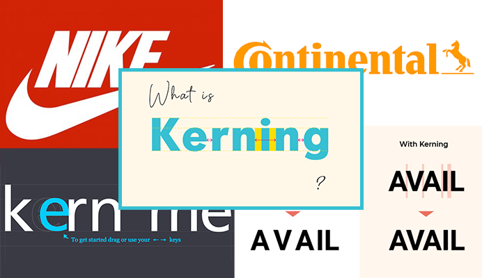
Your type can communicate your attention to detail as well as how much care you put into your product or service. An important aspect of the type is Kerning which refers to the spacing between the letters in a type; a detail that needs special attention. When used correctly, kerning can communicate as much to the consumer as the font choice.
150% Off
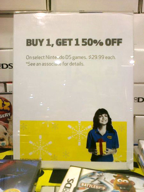
This sale sign is an example of a kerning mishap. The intention is to advertise to customers that the store is having a sale offering customers half off their second item, but because the spacing between the numbers “1” and “50” are so close, the advertisement can be mistaken for 150% off.
In this case, the business needs to consider kerning and adjust the spacing between the characters or start another line and align the “50% off” below “Buy 1, Get 1”. This mistake leaves the business vulnerable to customer service issues.
Another way to fix this sign would be to spell out some of the numbers. Generally, it’s good practice to spell out numbers ten and under. Spelling out the ones would also eliminate this issue and prevent any customer misunderstandings.
Yves Saint Laurent
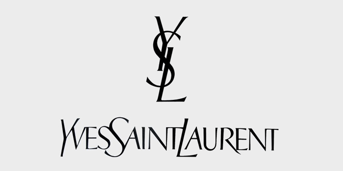
The success of Yves Saint Laurent’s new logo proves that the rules of kerning can be broken, but they must be broken strategically and with intention. Although kerning rules stress adequate spacing between type, this new logo challenges the rule by condensing the spacing.
By condensing the spacing between each letter while capitalizing the first letter of each word, the integrity of the name is still upheld. It is also worth noting that Yves Saint Laurent is a luxury brand that is well established and recognizable allowing them to get away with pushing the boundaries of typography and symmetry.
Zara

Breaking the rules doesn’t always work. Retailer Zara debuted a new logo that fell short when it similarly defied the rules of kerning. The wide spacing of the original logo was eliminated leaving the letters over lapping and the logo looking messy.
This ultimately made the logo difficult to decipher. German typographer Erik Spiekermann called the logo, “the worst piece of type [he’s] seen in years.” When breaking these rules, it’s important to have a purpose and be tactful in doing so.
Pearle Vision
![]()
The redesign for Pearle Vision’s logo is another example of a success. The franchisee who we worked with in 2012 admitted that the company’s system, marketing tactics and logo felt out of date and therefore felt unsupported at the time. The logo featured a font with tight kerning in a dark teal that felt dated and plain – not saying much about the brand.
In 2013, Pearle Vision underwent a major rebranding. In addition to updating their logo with a neutral color and a timeless font, the kerning used allows for each letter to stand on its own and be clearly legible.
The new logo also gives consumers more information. The date conveys when the business was established, and the graphic further illustrates that the brand operates in the vision and eyewear industry.
The Year 2011
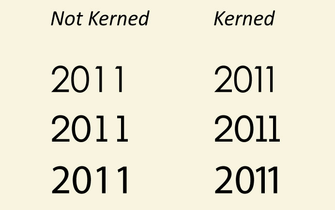
Apart from the Green Bay Packers winning the Superbowl, 2011 was special in another way. Due to the nature of spacing in ones, typographers and designers needed to pay particular attention to main body copy, layouts, and words. Certain fonts presented more issues with uneven kerning than others and presented a unique problem in typography.
While many had the luxury of the Adobe Creative Suite, our owner and CEO, who writes on the side, found he had to isolate the numbers and adjust the kerning to use the number 2011 in Microsoft Word. During this time, typographers and graph designers had to be more diligent when it came to their attention to detail.
Nike
![]()
Nike is an example of improper kerning that worked to make the logo special. They broke the rules of kerning and made it part of the creative process giving the brand character. This was intentional and strategic, and it produced a logo that was bold and recognized by everyone.
If Nike had followed kerning standards, this globally identifiable type would not have had the lasting impact we see today. Breaking the rules of kerning also speaks to their tagline – Just Do It.
Final Thoughts
Although there are rules, use them more as helpful guideline. Challenging them is part of the fun and can be successful. Keep it simple and pay attention to the details. The type you choose and the way it is presented can make a big difference – the little things can go a long way.