
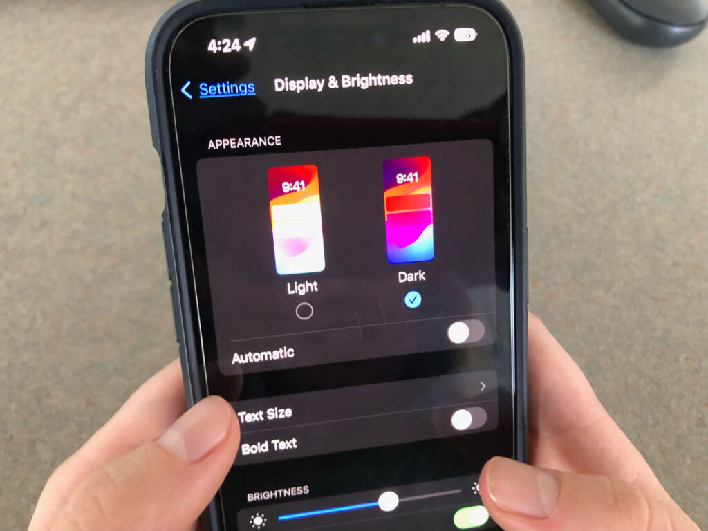
Dark mode, once a niche feature, has rapidly gained popularity across various digital platforms, from mobile apps to operating systems and websites. But what exactly is dark mode, and why has it become such a prevalent design choice? In this article, we’ll explore the origins of dark mode, its optimal usage scenarios, design considerations, and strategies for implementation.
How it Came About and Why?

The concept of dark mode can be traced back to early computer displays, where dark backgrounds with light text were commonly used to reduce eye strain and conserve energy. However, it wasn’t until recent years that dark mode gained mainstream recognition, driven by advancements in display technology and user preferences.
The primary motivation behind dark mode’s popularity stems from its benefits for user experience and accessibility. By reducing the amount of light emitted by screens, especially in low-light environments, dark mode enhances readability, minimizes eye fatigue, and prolongs battery life on devices with OLED displays.
At IH Concepts, we’ve incorporated dark mode support into our email newsletter design to cater to the diverse preferences of our subscribers. It’s important for a business to change with the trends. And here, at IH Concepts, we decided to reform our interfaces to be compatible with a dark mode layout so that we can stay updated for our users. Here are some of the things we’ve learned along our journey.
When to Use It and When Not to?
Determining when to implement dark mode depends on factors such as user preferences, context, and brand identity. Dark mode is suitable for:
- Nighttime usage: dark mode’s subdued color palette is ideal for nighttime browsing, reducing eye strain and providing a more comfortable viewing experience in dimly lit environments.
- Visual aesthetics: Dark mode can lend a sleek and modern look to interfaces, particularly for apps and websites with content-heavy layouts or multimedia elements.
However, dark mode may not be appropriate in certain situations, such as:
- Accessibility concerns: Some users may have visual impairments or sensitivities that make dark backgrounds difficult to read. In such cases, providing a light mode option or adjustable contrast settings is essential for inclusivity.
- Brand consistency: A basic dark mode layout may not align with the branding or design principles of certain products or services. In such instances, it’s essential to create a custom dark mode layout to maintain consistency across different modes while ensuring readability and usability.,
What Should You Do for Your Design When You Do Use It?

In some cases, implementing dark mode may be dictated by industry standards, platform requirements, or user expectations. So when designing for dark mode, make the most of available design resources and tools to optimize dark mode implementation within the constraints of various platforms and frameworks. There are several considerations that can enhance the user experience:
- Custom dark mode layout: As stated before, having a custom layout can maintain a more consistent brand image. However, another reason to utilize a custom layout is because most web engines or devices that allow users to change their display to dark mode often just invert the colors of whatever website the user is on. While this won’t cause any problems for some websites, most will look really unpleasant in a basic color theory way.
- Contrast and readability: Ensure sufficient contrast between text and background elements to maintain readability, particularly in low-light conditions. Use lighter text colors and avoid overly bright accents to prevent visual discomfort.
- Consistency across platforms: Maintain consistency in design elements and color schemes between light and dark modes to provide a seamless user experience across different devices and platforms.
- User feedback: At least initially, solicit feedback from users to identify areas for improvement and fine-tune the dark mode experience based on their preferences and usage patterns.
Conclusion
Ultimately, dark mode represents a significant evolution in digital design. And after implementing dark mode into our newsletter, there were benefits in terms of usability, accessibility, and visual aesthetics. By understanding its origins, optimal usage scenarios, and design considerations, other businesses can leverage dark mode to enhance the overall user experience and stay ahead in an increasingly competitive digital landscape.