
Admit it.
We’re all guilty of it.
Say it with me.
“I CAN’T GO ONE DAY WITHOUT MY MOBILE DEVICE (or an hour)”.
Yes, we love scrolling through our social media, or responding to emails through our phones. However, in this technologically driven age, mobile devices offer us much more. Almost anything that can be done on a computer can be done on our smartphones. Think online shopping, research for services or anything under the sun.
The bottom line is, if your mobile website is not optimized, your company is losing a huge chunk of customers. Users today expect a fully functional mobile website, without which, they wonder, “Are they even still in business?” On top of that, as of April 21st 2015, Google, recognizing that they make up 50% of mobile searches, made it a requirement for all websites to go mobile.
With all that being said, here are 5 tips your mobile website simply cannot do without:
1. Info should be immediate
Users are typically on their mobile devices when they are on the go or in a time crunch. What this means for you is that your mobile web should be able to deliver all its essential information, appropriate content and functions at a glance.
Oftentimes, when users struggle to navigate through the web, they give up and seek what they need elsewhere. This is equivalent to a customer leaving a store empty handed and frustrated because they could not locate what they were looking for.
2. Make essential info a priority
Say you just landed in Boston for a last minute trip. All you want is to find a hotel and call it a night, so you start browsing on your phone. Wouldn’t it be great if all the information you needed was right there without having to navigate in frustration?
Users today do not have the luxury of sifting through piles of information. Pinpoint the information that your user would need or want, and give them that, and only that.
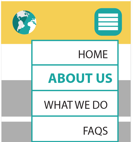
Pro tip: A focus group suggested that most people wish all mobile websites had a hamburger menu (link) for navigation.
3. Create effective clickables
Maximize ease – when you’re on the go, you’d probably rather click onto a phone number rather than copy paste it onto your dial pad. The same goes for information such as emails and directions. Instead of subjecting users through the copy paste inconvenience, clickables eliminates frustration by helping users to avoid misclicks and by minimizing walls of text which could be confusing under time constraints.
94% of users prefer having phone numbers, emails and addresses to be clickable. Of those 94% of users, 50% of them would actually leave the site to find another with clickables.
Convinced yet?
4. Minimize load time and data
This one might seem obvious, but we’ll emphasize it anyway. To put it into perspective, you could potentially lose 73% of your customers if your mobile website fails to load in a timely manner. And what do we mean by “a timely manner”?
Well, 83% of users expect a 3 second load or faster.
Mobile data is also still a user concern. While it is necessary to make a mobile website visually appealing, be mindful of data draining elements such as graphics and videos. If you can do without them, you might want to.
5. Think design and branding
What do Apple, McDonald’s and Coca-Cola have in common? Consistent branding which has earned them global recognition. When designing anything that represents your company, be it web or print, design with your brand in mind.
Creating brand consistency makes for a more recognizable company which could then increase client base. It also shows more credibility. It shows that your company has a strong sense of identity and ultimately increases your perceived value amongst clients.
Before running off to create that mobile website, here’s one last thing to keep in mind:
Your website is just one part of your marketing effort. Look at the whole picture.