As I travel out of town more and more, I’ve been relying on my iPhone for everything, from looking for a restaurant to booking a hotel. In our last blog, we talked about the important of the end user being able to find information easily.
This is especially true with the websites accessed on smartphones. When I drove 16 hours to Baltimore in 2012, I found myself at the end of a long drive, looking to order pizza and considered pizza restaurants that I could easily find their menu and phone number. I would engage only with those restaurants that had a mobile-friendly responsive site.
The most important thing for any small business that wants their business to succeed is to look at the mobile market. Technology is advancing day by day. With the advent of smartphones, more and more people and businesses are utilizing their phones to assist with planning their lives.
From calendars, text messaging, email, apps, maps, to voice recognition assistants such as Siri, the smartphone is the hub in which people communicate and function that can easily fit in a pocket or a purse and go anywhere.
It is evident that the mobile phone industry is expanding at an enormous rate. People began to use the Internet over mobile phones a decade ago, but these days cellular networks have evolved and internet speeds for mobile are faster than they use to be. According to PewResearch, 58% of all American adults now own a smartphone, up from only 18% in 2009.
So lets go back to my restaurant example. Imagine if the restaurant had a simple mobile friendly version of their website. One where the user can easily access a phone number, a menu, and even place an order on their phone.
According to Statista, 5 billion people are projected to use mobile phones by 2017. Knowing this, it is important that websites employ responsive design (the ability to adapt the layout and design of the website whether it’s being view on a smartphone, an iPad, or a desktop.)
If you are a restaurant or in an industry trying to target the demographic of Smartphone users, it’s essential to have a responsive version of your website. According to Mobile Commerce Technology, 72% of all smartphone users prefer a mobile friendly website. Many larger businesses such as Dominos, Pizza Hut, Kohls, and Marriot have already utilized mobile friendly websites to help their targets access information quickly and efficiently.
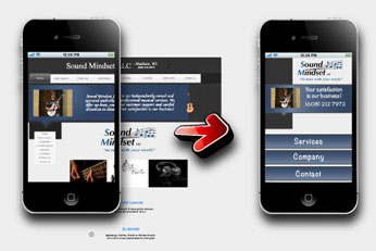
When developing a mobile friendly website, it’s important to know that the attention span of smartphone users is shorter than those on a desktop. With that being said, keep it simple. It’s important to only put information that is relevant and easy to find.
As an example, if you were a cab service, a visitor would not be looking to read an ‘About Us’ page or a ‘History’ page. The user would likely be out at a party, a bar, or at the airport looking for a phone number, looking to figure out cab fare, or request a pickup. In a mobile version, it’s important not to inundate your end user and allow that person to find information efficiently.
To have a mobile version implemented is often inexpensive, ranging from between $500-$1200. Often there are CMS systems as such as WordPress that offer plug-ins that convert regular websites to mobile friendly sites. However, it’s important that the plug-in will still allow you to customize links and the layout to ensure simplicity.
As time goes on, the necessity for business to adapt to the mobile phone is going to become more and more crucial for businesses to survive. Stay tuned to learn about mobile apps!