
Ever noticed how outdated trends that we swore we’d never be caught dead in eventually creep back into our lives? Well, design trends are subject to the same fate. In the past few years, graphic designers have shied away from bold, loud layouts and turned to minimalism.
However, as we welcome 2017, we’re seeing a circle back to more vibrancy. With some help from Venngage, here are some tips that will help you jump on board the design train:
1. Think loud, think bright
Many brands have fallen into the comfort of utilizing safe, neutral, easy to digest colors to connect with consumers. However, now that the market is so saturated with such styles, it’s hard to stand out.
Instead of staying with the herd, be fun again, get out there with some loud and bright colors! Your graphics will not only stand out, but will also be more memorable!
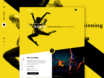
Image Source:
Robert Berki
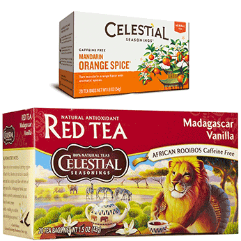
2. Bold is the name of the game
When it comes to typography, it doesn’t need to be in-your-face, but you do want to grab your audience’s attention at first glance in order to get them to read your content. It takes a lot more today than it did a decade ago to get a viewer’s attention.
Especially in this age where everyone seems to be in a time crunch, you NEED to be BOLD to get their attention. This transition that Celestial made is a great example!
3. Google’s got you
Two words, Google fonts. Well, for starters, they’re free. And as if that wasn’t enough, they’re some of the most versatile and easy to use fonts out there.
You’ll never have to work too hard to find fonts that look great together. They also tend to mesh well with your blogs or websites. To top it off, Google Fonts are universal across multiple platforms, so that’s one less thing to worry about.
4. Keep it real
Yes, there are some great stock photos out there. However, let’s not forget about branding. Whatever you put out there represents your company’s identity. Be the company that cared enough to create original photographs. Readers will recognize the authenticity and respond to it.
5. Back to the drawing board – literally
In this age of consumerism, brands face the challenge of cutting though the noise of their competitors and truly connecting with their customers. Nothing says genuine like a hand drawn graphic. It separates you from the pack and can also be that first step for a more personal connection.
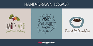
Image Source: Design Mantic
6. Minimalism with a twist
When we say minimalism here, we don’t mean your standard greyscale, safe, neutral tones. We do mean keeping the essence of your graphics simple enough, but with bold and fresh pops of color. In other words, the layout shouldn’t be busy, but it should also by no means be dull.
7. GIFs, GIFs, GIFs
If pictures speak a thousand words, then animated GIFs would speak a million. From a technical standpoint, they’re great as they don’t require any special software to run and have small file sizes.
From a branding standpoint, it catches the viewers’ eyes and are far more expressive than text and ordinary images. Because of data concerns, you’d want to be careful not to overdo it, but they’re a great alternative to still graphics every once in a while.

That got your attention, didn’t it?
8. Play with Duotones
Who says two vibrant colors don’t go together? Sometimes, all you need to do is find a couple of colors that complement each other to bring your graphics to life. Duotone layouts can get tricky in terms of designing, but the final product will be well worth your time. It brings originality to your website and draws people in!
As 2017 rolls along, we invite you to roll with these trends. Break free from the overly clean, white layouts and bring color and vibrancy back into your designing! Let this be the year to make bold choices for your branding!